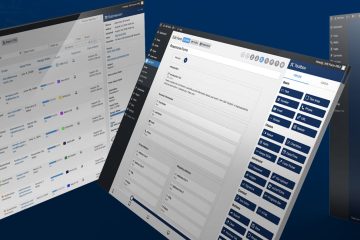
Improving the website management user experience

This summer, the Watchful team was careful to set aside time to rest and recharge on vacation in places like Naples (Italy), Thassos (Greece), and Vail, Colorado (USA). But we had some projects “simmering on the stove” that address the user experience of website management at Watchful.
We also introduced some new features and changes to existing features.
With the end of summer nearly upon us, I thought I would review these updates for you as you prepare to ramp up business heading into the Autumn season.
Website management user experience
We regularly tweak the Watchful interface to make the user experience of website management more intuitive, consistent and productive.
This summer we introduced three notable changes.
1. Consolidating the security tools
The first user experience change was a consolidation of the security tools in Watchful.
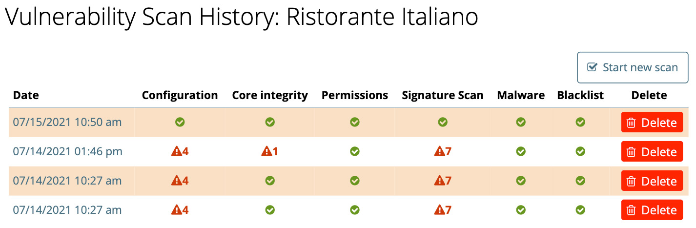
We described this in detail back in July. But in short, all of the security tools are now present in the Vulnerability Scan.
Here is a preview showing results from the malware and blacklist audits alongside the other security audits.
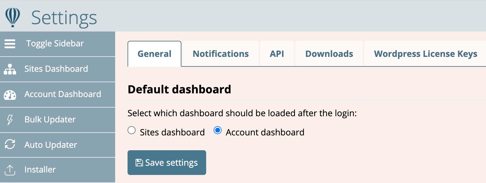
2. Account Dashboard as default interface
Back in May we launched the Account Dashboard as a tool to help Watchful users quickly identify the most pressing maintenance tasks across all the sites in their accounts.
You can now select the Account Dashboard as the default interface when logging into Watchful. Simply select the desired option in Settings as shown below.
Settings.3. Simplifying the Sites Dashboard
When first presented with the Sites Dashboard, users can sometimes feel overwhelmed by the options available to them (see below).
For example, a bulk toolbar for performing tasks on multiple sites at once stretches across the top of the interface. Immediately below the bulk toolbar sits a number of fields for filtering the list of sites.

Especially for new users, neither the bulk tools nor the filters nor the are particularly useful when adding your first sites to Watchful. And the purpose of each is not immediately obvious. So we decided to make two changes:
- Collapse the bulk toolbar into a drop-down menu labelled
Bulk Actions. This removed a number of elements from the interface as well as provided an intuitive title that helps new users understand their purpose. - Disable the filter by default for all accounts.
Here is the end result:
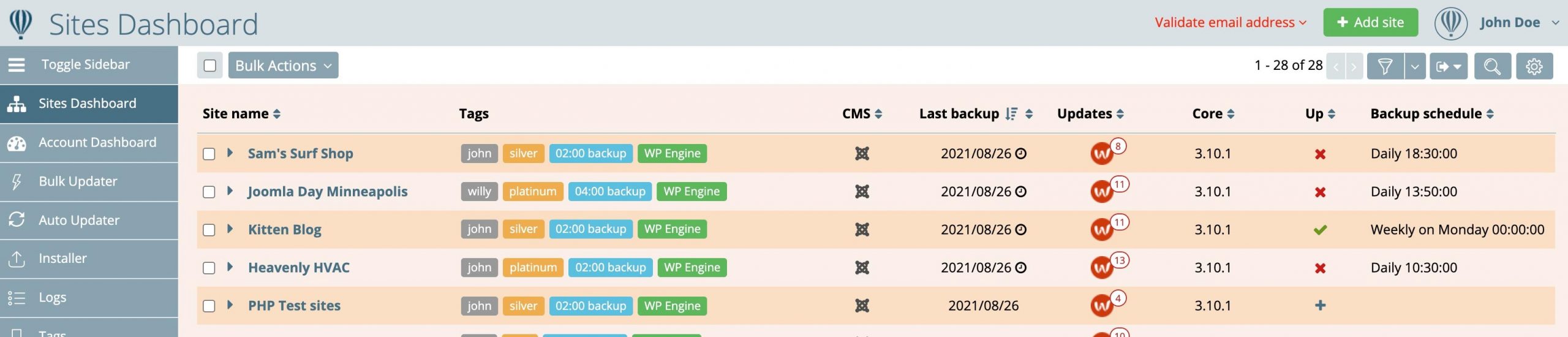
As you can see, the website management user experience is much simpler in this layout and more sites are visible in the same space.
Experienced Watchers who use the filters often have two options: (i) click the filter icon at the top-right to temporarily reveal the filters or (ii) click the gear icon at the top-right to customize the default display (full details here).
New feature in the report builder
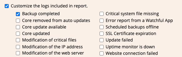
Aside from changes in the user experience for website maintenance, we also introduced a new feature this summer: the ability to include log entries of completed backups in client reports.
Clients love to know how much work you are doing on their sites and including a list of each and every backup is a great way to show value in client reports.
This feature is easy to enable in your existing reports, or to enable when downloading or scheduling a new report. Simply select Backup completed when customizing the log entries in the report builder.
Color-coded notification emails
By default, Watchful sends email notifications when it detects changes on your site. These can include general information such as a software update or installation or warnings and errors.
As the number of sites in your account grows, the emails can get rather long with data from all of your sites in one message.
Personalizing the content of notification emails can reduce the length of these emails. But we recently added color-coding as well. As shown below, this makes it easy to identify the warnings and errors at a glance.

Revamped accounts & subscriptions
Historically, the account & subscriptions area at Watchful has not been part of the core Watchful app. As a result, the layout and UI never really matched the rest of the application.
We decided to completely revamp this area using the colors, tabs, and other existing UI elements Watchful users are already familiar with.
Below you can see the tab-based layout that are also used in the Watchful settings.

Plan tab in the account and subscriptions area of Watchful.Vulnerability scan retention time
As noted above, the Vulnerability Scan is a suite of security audits. When a vulnerability scan completes, the saved results appear in the Vulnerability Scan History as shown below.
Reviewing the issues detected in a scan is as simple as clicking the date of the scan from the list.
Historically, the results of vulnerability scans have been saved indefinitely. Effective today, retention time limits have been applied to these results.
Results from vulnerability scans are saved for different lengths of time depending on the type of plan:
- Free plan – 7 days
- Legacy plan – 30 days
- Premium plan – 90 days
Over to you
We’d love to hear your feedback on the changes we made above. Feel welcome to leave a comment below.


0 Comments