Improved updater usability for single sites
The single site software updater is one of the most-used tools at Watchful. We recently released a new version of this tool with improved updater usability.
Usability problems with the single site updater
Despite being a popular tool at Watchful, the single site updater, shown below, has a number of usability issues.
Perhaps the largest issue is one of space. This tool appears in a modal/pop-up window constrained for width. Three factors exacerbate the lack of width.
First, the updater displays current and target versions as separate columns where the header text is wider than the actual content (labelled “A” below). Next, the automatic update buttons have unnecessarily long language strings (labelled “C” below). Similarly, the text displayed following a successful update is more verbose than needed and wraps to a second line (labelled “E” below).
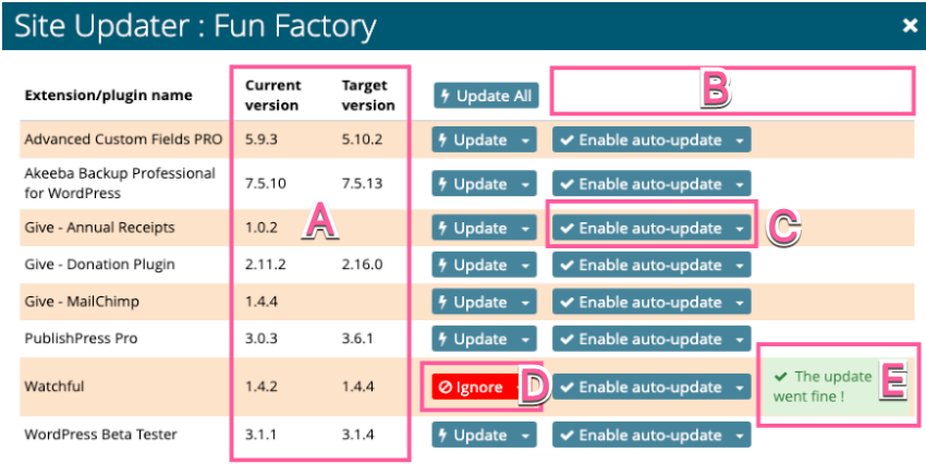
The second major issue has to do with clearly communicating information to the user. For example, the automatic update and notes/status columns lack headers, confusing some users (labelled “B” above). Further, the update button switches to a red-colored ignore button when an update is complete (labelled “D” above).
The ignore feature is an option in the update button dropdown menu. Revealing the ignore button after an update completes doesn’t make much sense. Why would one want to ignore updates that are working as expected? And confusing the red color as an error or problem with the update is likely.
Taken together, the single site updater was due for an upgrade of its own.
Improved updater usability
To solve the usability issues noted above, we made a few changes.
First, we reduced the space required to show the software version information.
Next, column headers were added for all columns including automatic updates. This allowed us to make the button text for enabling automatic updates very clear and take up less width.
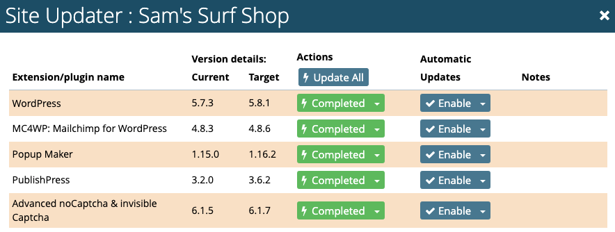
Finally, we entirely removed the note that displays when an update completes successfully. In its place we now display a green-colored completed button in the actions column. The green color and concise text eliminates any confusion and again saves width.
Here again is the resulting single site updater following a number of successful updates.
What about the bulk updater?
Watchfuls bulk updater uses many of the same UI concepts as the single site updater. However, it does not have the same width constraints.
Nonetheless, we will be applying similar improvements in the bulk updater to improve usability and consistency across the platform.
Our focus on usability
Usability is important to the success of any online service and we’ve focused a lot on this area in recent months.
We had a large release of improvements across many areas of the platform at the end of the summer. This included decluttering the sites dashboard and color-coding notification emails.
We also merged a few overlapping security tools into a single vulnerability scan and even spent time improving the humble website note feature!
Perhaps our largest project was a new productivity dashboard. It helps users quickly identify the most urgent maintenance tasks across their entire agency.
On top of all this, we are continually making smaller, unannounced changes. This includes improving the language used across the platform and rewriting the user profile manager.
Together, these changes keeping pushing us towards our goal of improving website maintenance productivity while improving and clarifying information delivery.
Over to you
If you have any suggestions on ways to improve the usability of Watchful, we’d love to hear them in the comments below.


2 Comments
Nicola Fleming · November 10, 2021 at 3:20 PM
Great work guys, especially the change from red to green button, makes much more sense!
Vic Drover · November 10, 2021 at 4:20 PM
Thanks Nicola! I think we had been looking at it for long, we looked past these issues. It’s always nice to revisit something and try to use fresh eyes.