5 things you’ll love about the new Watchful Dashboard

The release of new features is a common event here at Watchful. This includes recent features like YubiKey support, the SEO audit, and the host of tools released over the summer.
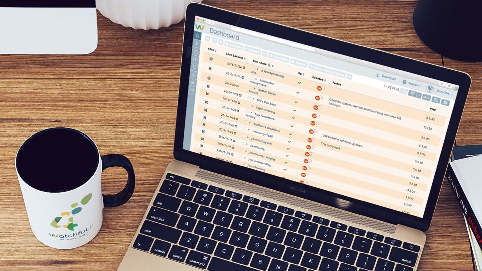
The Watchful Dashboard has received the makeover we previewed earlier this year, as some of you have noticed.
This is the fourth version of the Watchful Dashboard and we think you’re going to love using it. Here’s some reasons why.
1. Customizable content
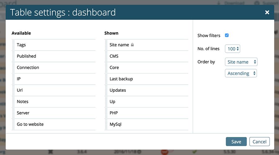
Undoubtedly, the most exciting change is the ability to customize the information displayed on the Watchful Dashboard. For example, if you don’t use Tags to organize your sites, now you can remove the Tags column from the dashboard entirely.
Like to keep a close eye on PHP versions? We have you covered: you can add that to the Watchful Dashboard with just a few clicks.
In the top-right corner of the Dashboard, there’s a gear icon to access the Table setting dialog. This is shown in the image below. This allows you to add and remove content from the Dashboard.
You can even specify the order of the columns, how many sites to display per page, and the default ordering parameters.
Additionally, you can customize the Updater, Remote Installer, and Tags Manager in a similar fashion.
We’ve fully documented the table customization process in an instructional video in the Knowledge Base and listed all the items that may be displayed on the various tables.

2. Ready for multiple CMS types
Once you start using the new Dashboard, you will realize very quickly that you can add a CMS column.
There’s also a CMS filter that has both Joomla and WordPress as selectable options.
Not surprisingly then, Watchful will soon publicly support WordPress sites. In fact, our beta testers have been managing WordPress sites in Watchful for a few months.
We’ll have more to share on this soon.
3. Intuitive bulk tools
One of Watchful’s most powerful tools has been on our hidden secrets list for a number of years: the Bulk Toolbar. This toolbar allows you to perform the same task (i.e. installing an add-on or adding a tag) on a carefully selected set of sites.
The Bulk Toolbar is not well known as prior versions of the Dashboard kept the toolbar completely hidden until one or more sites were selected using the check boxes at the left of each site.
In the 4th version of the Dashboard, we’ve taken a page from the toolbar in the wildly popular GMail user interface: the Bulk Toolbar will now always display but will not be useable until 1 or more sites are selected.
Since the Bulk Toolbar really boosts efficiency when performing site maintenance we are hoping this change to the user interface greatly increases the profile of this valuable toolset.

4. Persistent Filters
Filters have also received some enhancements. As shown below, you can save set filters to your settings. This means that the filters will re-apply after you log out and log back into the Dashboard.
A good use-case for this feature is only displaying your published sites in your Dashboard.

5. More space for sites
Over the years we’ve strived to make the Watchful Dashboard as efficient as possible. Early on, we focused on improving the speed of the Dashboard and the migration to an AngularJS-based platform last year was a massive step towards achieving this goal.
In the current version of the Dashboard, we wanted to clean up the top of the interface so that more sites could be viewed above the fold.
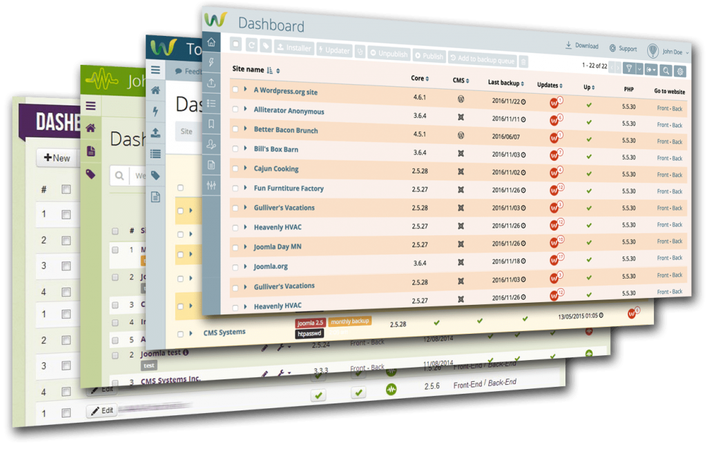
As shown below, our efforts have been largely successful. Compared to prior Dashboard versions most popular screen sizes can now display up to twice the number of sites without scrolling.
The evolution of the Watchful Dashboard is shown below. As you can see, the extra room for sites in version 4 is made possible by minimizing white space and auto-hiding the filters (which is part of the Dashboard customization described above).

We really hope that the new Watchful Dashboard continues to reduce the time required for common mainteance and monitoring tasks and we welcome your feedback below in the comments.


0 Comments